


By Josh Barr
It was a straightforward but considerable challenge: In designing a new logo for the U.S. Olympic & Paralympic Museum, the charge was to create a unique identity for the Museum that is set to open in Colorado Springs this summer.“In my mind, I was envisioning that if there were three flag poles in front of the Museum, with the Olympic rings on one flag and the Paralympic agitos on another, what would I want on the Museum’s flag in between them?” Museum Chief Executive Officer Christopher Liedel said. “We wanted to embrace the movement of athletes, embrace the rings, embrace the agitos and embrace the Museum’s architecture.”
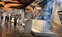
Set to open later this year, the 60,000-square foot U.S. Olympic & Paralympic Museum is dedicated to U.S. Olympic and Paralympic athletes and their compelling stories, with the artifacts, media and technology behind the athletes who make the United States proud. The Museum will focus on the core values of the Olympic and Paralympic movements: friendship, respect and excellence; determination, equality, inspiration and courage.
The responsibility for creating the design fell to the firm of Chermayeff & Geismar & Haviv. Partner and principal designer Sagi Haviv did his homework, traveling to Colorado Springs to visit the Museum during construction, talking with Museum architects, athletes and others involved in the planning of the Museum.
“For us, the challenge was also the most exciting aspect: To draw inspiration from the most recognizable and ubiquitous icons in the world – the Olympic rings and the American flag,” Haviv said. “The strategy was that it should be something new and innovative that can stand on its own. Find something that gives homage but is still ownable and can be trademarked on its own. That’s the magic, if you can find that balance between an inspiration and yet still have independence.”
The Museum’s new logo, unveiled Wednesday, May 13, takes its colors from the Olympic rings and Paralympic agitos, its stripes from the American flag and the diamond silhouette from the Museum’s exterior. Together, these elements suggest an abstract flame.
“We usually say a logo doesn’t need to say very much — the less it says, the better,” Haviv said. “But in this specific case, the logo is unusual in that it does have very clear references to familiar iconography.
“We were able to strike that balance. It’s a mark that reminds you of all kinds of things but has its own distinct character, look, feel, shape, personality and above all, it is dynamic.”